Adding context to today's school district rankings
1/23/2012
The Florida Department of Education released their first ever School District Rankings today, ranking every district in the state from 1 (best) to 67 (worst) based on district wide student FCAT performance last year. Based on this criterion alone, Duval County ranked 50th out of 67 districts in this year's rankings.
There has been much debate over whether simply ranking districts by FCAT performance - without taking into account any other factors, such as percent minority students, percent of students receiving free or reduced price lunch, or county wealth - is an overly simplistic or potentially misleading barometer of performance.
The state's perspective, as noted by Commissioner Robinson in his conference call with the media this morning, is that the rankings are based only on information which has always been previously available, it is just now being presented in a more straightforward list to make the information easier for the public to understand and to engage with. From the perspective of many districts, it is an oversimplification of performance and unfairly compares larger or poorer districts with high levels of students requiring special services directly to smaller and wealthier districts not necessarily dealing with the same issues.
Whether or not the rankings are "oversimplified" is a matter of how they are interpreted or used moving forward. Taken alone, however, they are certainly a simple measure.
To think a little more about what we might be able to learn about district performance in context from this information, we dug a little deeper behind these rankings and ran a few simple analyses to control for the unique situational factors of each county.
To consider context along with the FCAT performance ranks, we ranked each county based on:
(1) district size (total enrollment),
(2) district percent of students receiving free or reduced price lunch,
(3) district percent minority enrollment, and
(4) county-level per capita income.
We also looked at percentage of student population enrolled in private schools during initial analyses, but it did not significantly contribute beyond the factors already accounted for.
By combining these four criteria, we created a new index ranking each district from 1-67 based on expected student performance as a function of these commonly-used demographic variables. In preliminary analyses, we found a high correlation between the districts we would expect to perform well based on economic and demographic factors and the rankings.
To look closer, we ran a regression analysis to predict School District FCAT rankings from district size, per capita income, minority population and free and reduced lunch populations. We found that these four demographic variables alone accounted for about 61% of the variance in the School District FCAT Rankings.
This is where we can start to learn more about what's working in education. That other 39% of the variance would include (though not necessarily be limited to) the different district and school level education effects that we are really interested in.
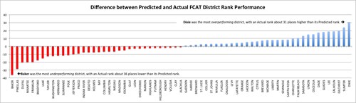
To try to learn more about how we can use these rankings to identify education effects that are working, we compared the actual rankings of all 67 districts to their predicted ranks, or where we would have expected them to be performing based on their economic and demographic profile.
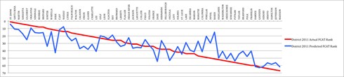
In this graph, we see each district's actual School District Ranking in red, and their predicted performance rank in blue.
If a district's predicted performance (blue) is below the red line, that means that district is performing better than expected based on their size, students and economy. So, for example, Dixie county actually ranked 12th in their School District ranking, but based on their high percentage of students receiving free or reduced price lunch (73%) and relatively low per capita income alone, we would have predicted them to rank about 42nd. Dixie is clearly over-performing (or somehow "adding value") as an education system. All of the districts we see with actual ranks significantly above their predicted ranks are districts we should be looking at to learn more about what they are doing that's working so well.
In contrast, if a district's predicted performance (blue) is above the red line, that means that district is performing worse than expected based on their size, students and economy. For example, Baker county actually ranked 51st, but based on their small size and low percentage of minority students or students receiving free or reduced price lunch alone, we would have predicted them to be about 15th.
Based on our economic and demographic predictor variables, Duval County would be expected to rank about 30th in the state, so what other factors might be at play that account for that difference? Join the conversation by commenting below.
-- Jason Rose
UPDATE: Here's another way of looking at it. In this graph, each district is listed by the amount it over-performed or under-performed.